
In what seems like the billionth episode of Tech Companies Revamp Their Logos, Facebook is at it again, pushing forward with a flat design aesthetic. It’s almost as if all the major tech powerhouses, including the usual suspects of Google, Apple, and Microsoft, have formed a club — slowly but surely so as not to arouse suspicion, they’ve each vowed to reduce their logo’s details until it’s a simple dot on the screen. And let’s face it, Facebook is striving to be the club president.
Heading over to Facebook’s super-detailed design page, the company speaks of evolving and unifying the brand identity across all user touchpoints – which in simpler terms means making sure its logo looks the same everywhere, but hopefully better. So, what’s new under the Facebook hood? The company is so glad you asked.
It wants to make the most noticeable parts of its brand even more noticeable, for one. There’s a push to harmonize how the brand appears everywhere, from the mobile app to ads on desktop. It’s jazzed up its color palette, but don’t worry, it’s still mainly blue. Just more kinds of blues.
In its mission to keep things fresh, the company has given the Facebook logo a “bolder, electric, and everlasting” twist. And by that, it means it’s picked a punchier shade of blue. Dave N., Director of Design at Facebook, chimes in with the sentiment that while it wants the logo to feel new, it’s more like a rejuvenation spa treatment for the iconic “f” icon.
Oh, and the company has also tweaked its Facebook Sans font a bit for better legibility. While it was in the creative spirit, it has also thrown in more shades of blue. Variety is the spice of life, after all.
And Reactions are getting spruced up, too. The colors are more vibrant and accessible, and the design now caters to a wider range of emotions. Still waiting on that sarcasm emoji though.
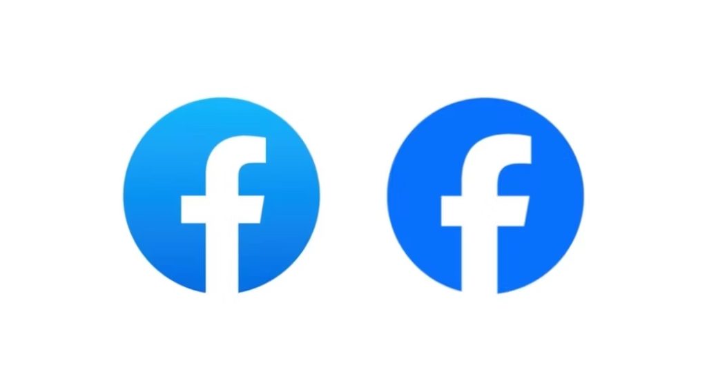
Facebook’s outgoing logo (left) next to the new one (right)
This revamp isn’t just about aesthetics. It’s a whole movement within Facebook, driven by multiple teams working in sync, to ensure that Facebook feels like Facebook. May H., Director of Design at Meta, emphasizes the harmony between different teams, all with the aim of making Facebook’s design sing a familiar tune.
With these design tweaks and changes, Facebook and parent company Meta are embarking on a quest for consistency, adaptability, and a seamless user experience. While the logo seems to be on a diet, shedding details left and right, the grand vision has perhaps fattened up a bit after these changes. Given the speed of these revamps, perhaps the next step is a logo that beams straight into our brains.


